UX/UI design of a water drinking reminder app FOR MOBILE
Our brief:
Create a mobile native app for the US based non-profit organisation “Daily Health Conference” with almost 40 years of experience in the field of health care communication. The organisation offers an online membership, only its´ program is not up to current technological standards. They want to reverse the trend of dropping subscription rates by offering more value to their members by creating a set of mobile apps. Along the way they also want to update their image to display an innovative approach to wellness again. The app should address any aspect of personal well-being; it should monitor users progress and encourages their healthier lifestyle; users must retain control over their personal data (GDPR Compliance). User interface should reflect a new & updated image aligned with the clients´ values.
The scope: my duo team was formed with Eleonora Pogostina, we had 10 days to come up with the high-fidelity prototype, working together remote only.
If we were able to address any aspect of personal well-being with our app, why did we choose the water reminder? We were attracted to the challenge… Would it be possible to create an app with more value than non-value for something as natural and necessary as drinking water?
FIRST STEP: RESEARCH
Quantitative research in form of an Online survey for broad questioning on the topic
As preparation for our survey we used the concepts lean UX canvas and the lean survey canvas to define our strategy. We then send a survey per mail in order to get an overview over existing drinking water habits, as well as a feel for people´s view on using apps for something like drinking enough water. We collected 66 responses with the survey. One of the most interesting results for us was that while it was clear people cared about the amount of water they drink in a day (69,2% of the respondents answered “yes”), the majority of them also knew days when they realised towards evening that they hardly drank any water (60% “yes”). See below figure 1 and 2.

And while it was also clear that people managed to drink other drinks, it also became apparent that almost half of our respondents (47,7%, see below figure 3 and 4) would not want to use an app as reminder for drinking water. I could relate. And at the same time, the people who answered “maybe” to that question displayed 30% of our group. Which could also be seen as a possibility for thinking about an app that offers more reasons to use it than to forget about it.
How does the market for water drinking reminder apps look like?
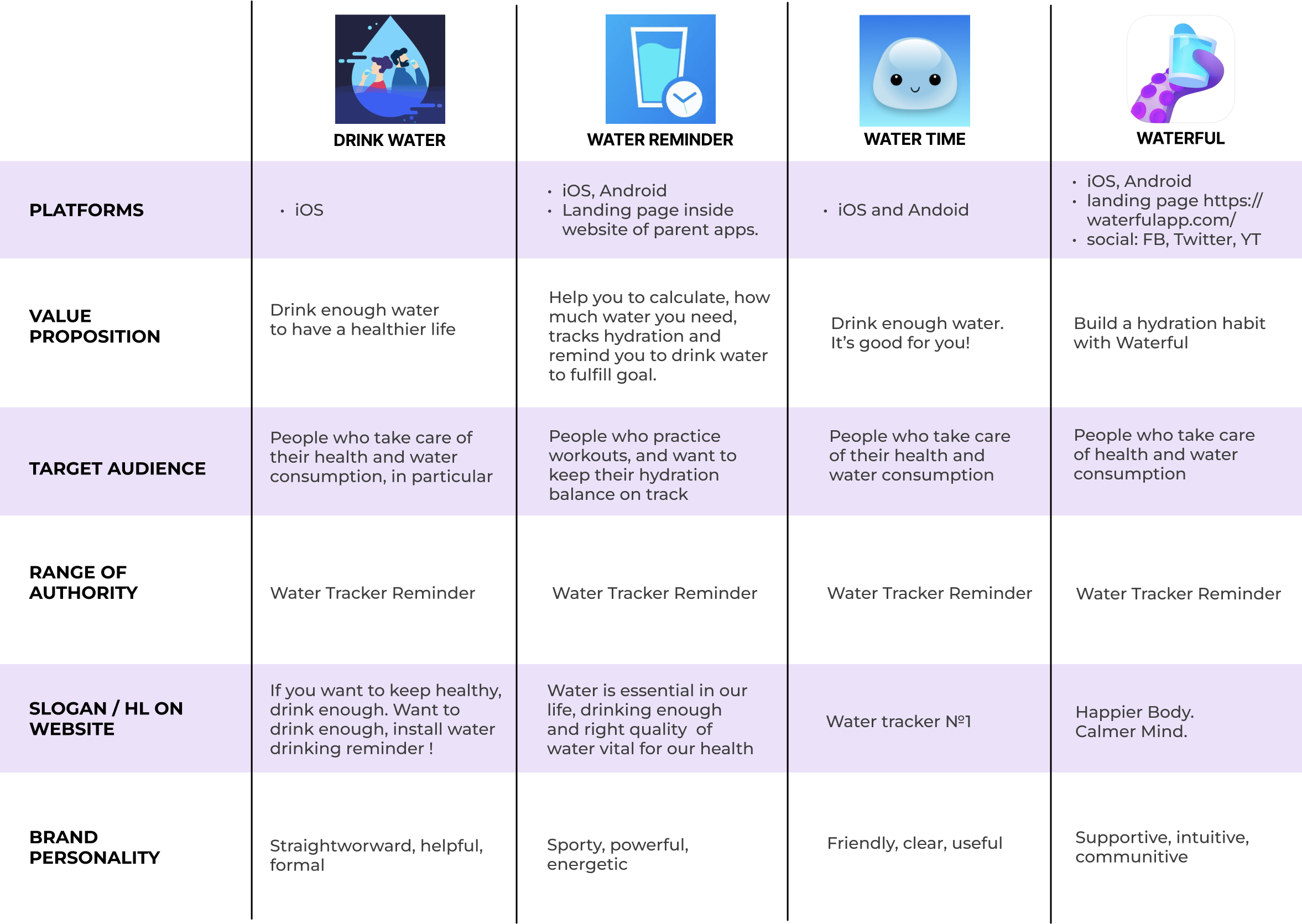
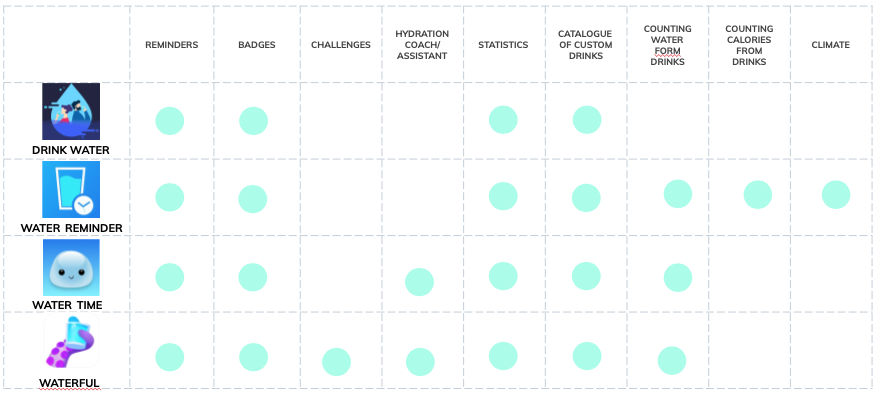
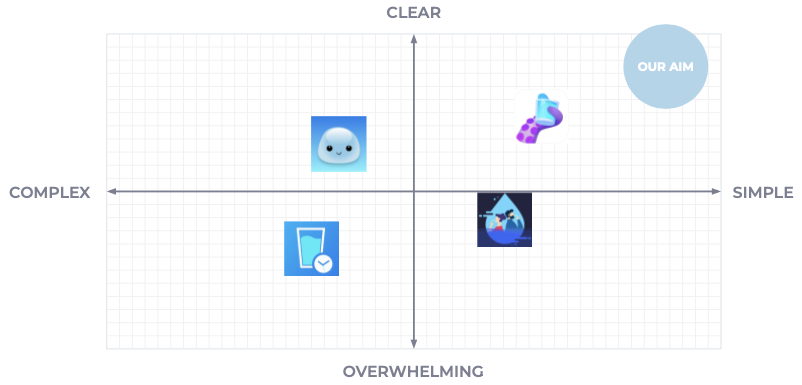
We did our research, starting out with a competitive analysis —main finding: water tracker reminder is a must to be competitive, and there is definitely room to be different about it, since they come along either quite formal, or super playful/cute. Additionally we conducted a feature analysis — main finding: we need challenges, statistics, a possibility to track water intake and to calculate the daily goal; and our market positionings´ main finding: there is room for an app that really is a very clear and simple solution.
Qualitative research in form of 5 user interviews
With an affinity diagram we organized our most hitting insights while using dot-voting as tool. “It is difficult to implement a habit: I download an app, think it is cool, but then I just forget about it and stop using it. Eventually, I am just annoyed by the reminders.” many other insights were very relatable and also offered a rich starting ground for us — the annoying sides of using apps like: “how can one avoid that annoyance and keep up the initial positive feeling about the app?” as well as the factors that works in the favour of an app: “I like documentation in a visual way and also a challenge”.
“Drinking water — it is so basic, I don´t want to have an app for it, I want to do it naturally.”
“I had a Tobacco quitting app, it wasn’t successful. It was too much work to open app and add something all the time you go out to smoke.”
“My motivation for drinking enough water — most of it is to feel good.”
“I like to see the statistics. It was good to see how you are doing when you trying to quite something, how you come closer to your goal.”
“I used to use one water drinking app long ago just for fun, I liked the game format.”
We had enough information for creating a relevant User Persona…

…and to map out her user journey

The user flow, designed to prevent her pain points before coming into existence

When developing and testing our wireframes, we found out that our app definitely needs:
clarity to be trustworthy
reminders to be useful
challenges to motivate

Hand-drawn concepts

Mid-fidelity wireframes
USER INTERFACE DESIGN

Brainstorm
…for key attributes in order to create a…

Mood board
When we tested the mood boards by asking for free associations, people came up with: natural, refreshing, life, calm, poetic.
“I love having a bottle water next to me, I just love looking at it.””
Style Tile

High Fidelity Screens for Android

From low-fidelity to mid-fidelity to high fidelity

Final high-fidelity prototype for iOs
Features included within the high-fidelity interactive prototype for iOS (Apple´s iPhone):
a welcome and a goodbye animation
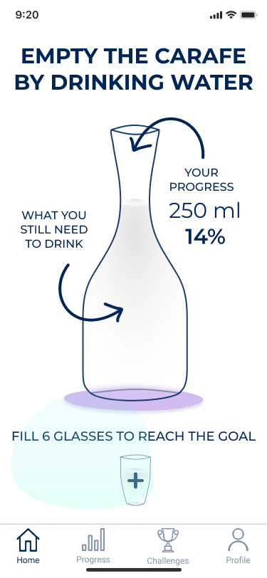
micro-interactions of a carafe being filled glass by glass
a carafe being emptied while filling water glasses
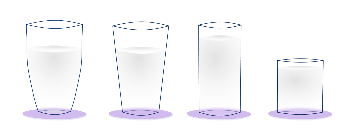
glass customisation
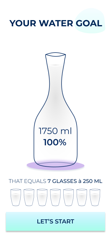
onboarding to add personal details crucial for calculation of the daily water goal
an error page if you do not fill in the data, a consent page for the details
an overview over progress & statistics over time
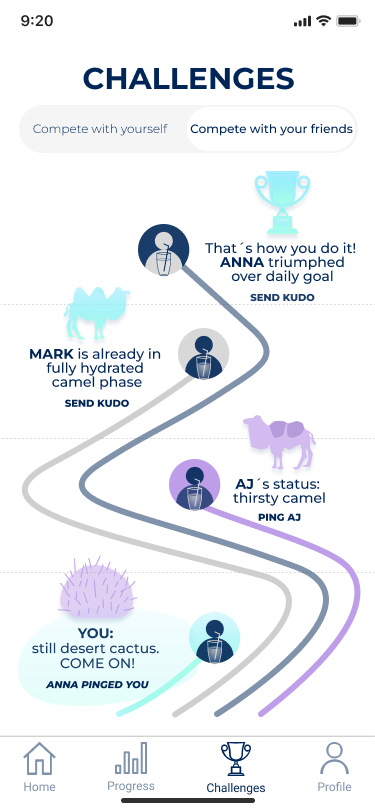
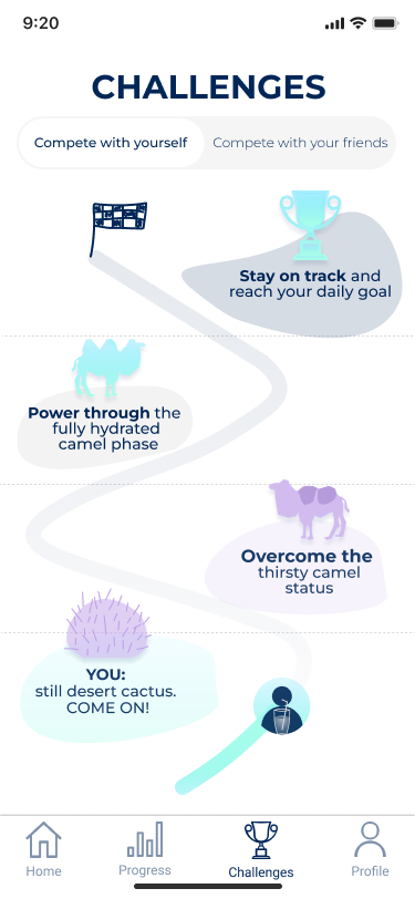
a challenge to compete with friends or to challenge oneself
the possibility to engage with friends by sending pings when they drink little and kudos when they did well
screens with reminder notification and a user profile page where one can adjust
the settings with activity level per day, climate one is currently in and the reminder frequency
My favourite screens
Key learnings and next steps
I am really happy about the results, and of course there are things to fine tune and adjust. For starters, the copy, as well from a UX writing perspective and also with typography glasses I want to readjust sizes, hierarchy and negative space. The next step would also be the development of a desktop version to stay on track during a busy day in front of the computer, it would be great if one would being reminded on the same device that often seduces you to postpone drinking water for far too long.